Lie Detector – Sign-Up Flow Redesign
Redesigned the Lie Detector experience using known user pain points and UX best practices to streamline the flow. Improvements led to a 14% increase in conversion, directly supporting product growth and engagement.
Role: Lead Product Designer. Collaborated with Marketing, Engineering, Legal and Compliance teams.

The challenge
The existing 6-step sign-up flow was a major barrier to user acquisition, with high drop-off despite strong traffic. The challenge was to redesign this critical path to reduce friction and improve conversion, while balancing input from cross-functional teams.
The problem faced
“How might we improve conversion through a more intuitive sign-up experience while also capturing leads from users who don’t complete the process?”
High drop-off rates in the sign-up flow indicated usability friction or unclear value, suggesting a need for a more intuitive, user-centered experience.
Missed opportunities to capture partial user data meant users who abandoned the process couldn’t be retargeted or nurtured into conversion later.

Business Impact & Results

High Stakes, High Volume
With significant daily traffic, optimizing this flow was critical to unlocking business growth.
Strategic Priority
This sign-up flow had historically been a top-performing conversion path—but performance had plateaued, stalling new customer acquisition.

Results
A 14% lift in conversion, directly increasing new customer registrations and strengthening the sales pipeline
User-Centered Wins

More Users Successfully Onboard
A 14% lift in conversion meant more users gained access to the product, successfully completing a previously challenging sign-up process

More Approachable Experience
The new flow removed unnecessary friction and simplified the journey, transforming a once-intimidating process into one that felt clear, welcoming, and easy to complete.

Major Drop-off Reduction (53.5% → 22.5%): The original step 1 caused over half of users to abandon the flow. Post-redesign, drop-off fell dramatically—evidence that early friction was effectively addressed.
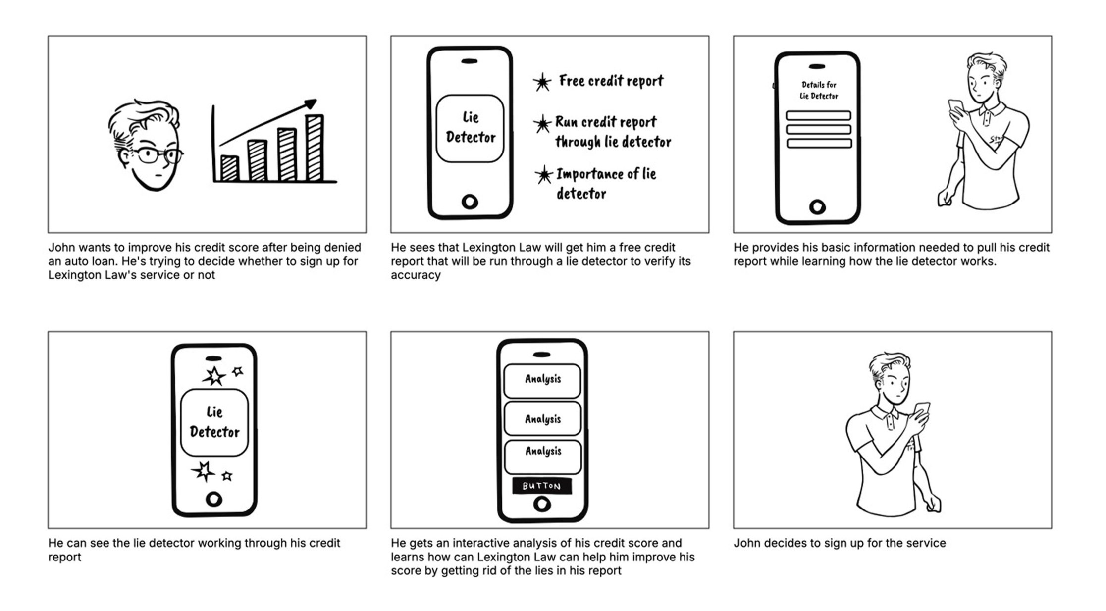
Ideation
Partnered with CX and Marketing to create a detailed storyboard of the redesigned sign-up flow.
Mapped each step of the user journey and highlighted key interactions to make the concept tangible.
Used a clear, step-by-step format to align all cross-functional teams on vision, functionality, and experience before development.
Saved time, avoided misunderstandings, and ensured a shared direction from the start.
The Solutions
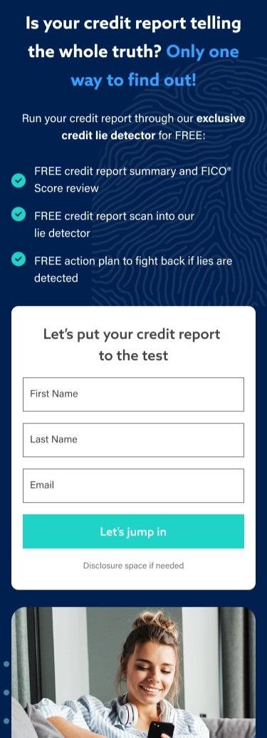
Streamlined Step 1: From Friction to Conversion
Problem:
The original Step 1 overloaded users with six mandatory input fields—many of which weren’t essential for immediate lead generation.
Impact:
This caused the highest drop-off rate in the entire flow, stalling new user acquisition before it even began.
Solution:
Cut the form down to only the essential fields needed to create a viable lead, removing unnecessary hurdles.
Bonus Impact:
Updated the visual design to align with the refreshed brand identity, ensuring a modern, consistent, and welcoming first impression.
The Outcome
Drop-off rate slashed from 53.5% to 22.5%, allowing more users to advance in the sign-up flow.
Input fields reduced by 50%, removing unnecessary friction.
Lead generation streamlined, capturing viable leads earlier with minimal user effort.
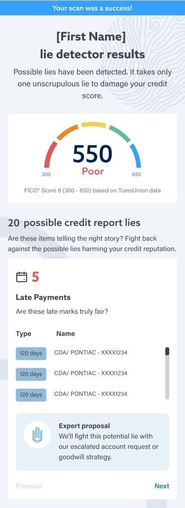
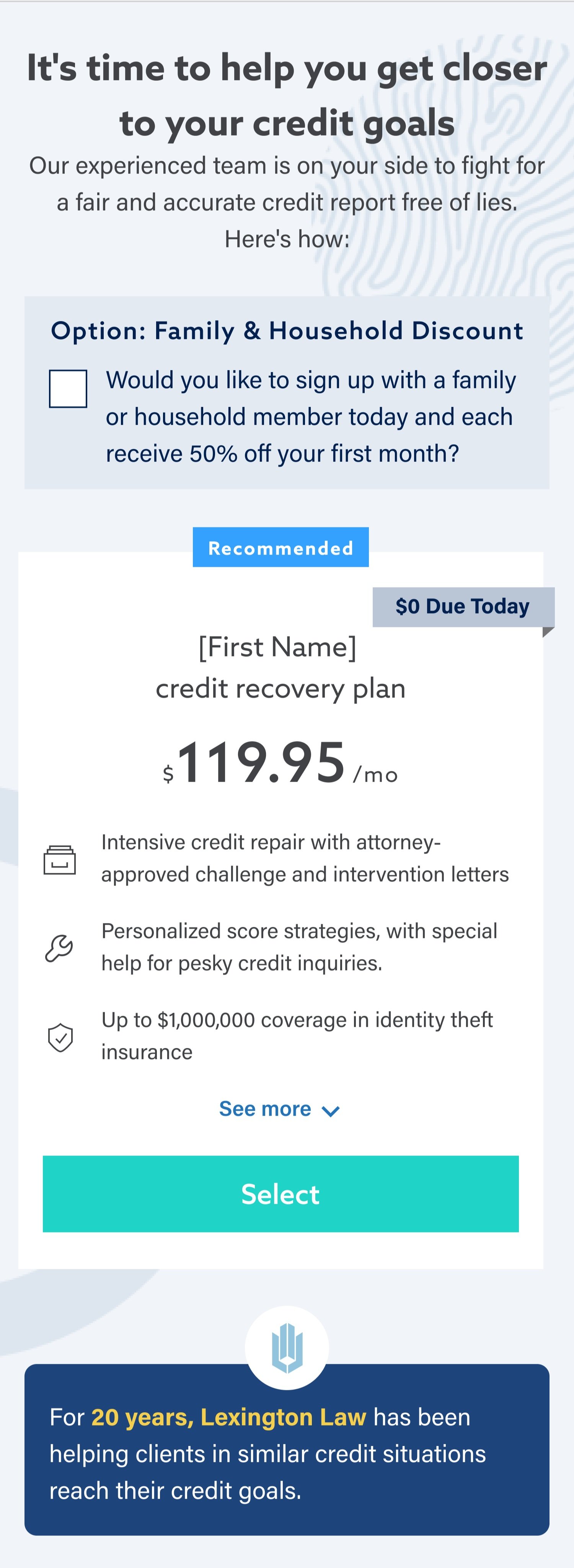
Optimized Credit Assessment Results: Clarity and User Empowerment
Problem
The old results page was excessively long with wasted white space, making it hard to scan and overwhelming to users.
Reviews and FAQs were misplaced, cluttering the flow and distracting from the primary goal of understanding credit results.
Solution
Refocused the page exclusively on credit assessment results, removing irrelevant sections.
Added richer insights into the credit report for clearer context.
Introduced an Expert Proposal section to show how our service would specifically help users.
Built a Prioritization Control feature, allowing users to see which items we’d address first and reorder them—empowering them to take control of their credit journey.
Impact
Users received clearer, more actionable results, reducing confusion and increasing trust in the product.
The streamlined layout improved readability and confidence, making the experience more professional and user-centered.
Bonus Impact
By letting users prioritize items themselves, we fostered a stronger sense of control and transparency—two key drivers of trust in financial services.
The Outcome
50% less information —reduced cognitive load and made results easier to understand.
Clearer financial snapshot gave users confidence and control over their situation.
Increased brand trust by removing clutter and focusing on meaningful insights.
Expert Proposal & Prioritization highlighted our strategy, boosted credibility, and empowered users to shape their credit repair journey.
Enhancing Plan Clarity: From Vague to Value-Driven
Problem
The original Plan Details section was too vague, with only four generic bullet points.
No additional plan information was available elsewhere on the site, leaving users with incomplete knowledge.
Competitors offered far more transparent and detailed breakdowns, making our plans look weaker by comparison.
Solution
Expanded Content: Partnered with the Marketing team to add more bullet points and create a clearer, more transparent plan breakdown.
Collaboration & Compromise: While I advocated for an even more detailed version, this iteration represented the best balance Marketing was comfortable with.
Trust-Building Transparency: Clarified exactly what users receive, making the offering more competitive and appealing.
Impact
Users gained a clearer understanding of value, reducing hesitation and improving sign-up confidence.
Our plans became more competitive in the market, helping close the gap with rivals.
By offering more transparency upfront, we built greater trust in the brand and boosted conversion potential.
The Outcome
The clearer plan breakdown reduced support inquiries related to plan details, giving users more confidence in their choices while freeing the support team to focus on higher-value interactions. This transparency also reinforced trust in our brand.
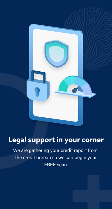
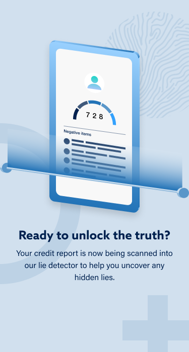
Bringing the "Lie Detector" to Life: Animation as Engagement
Problem
The credit report loading screen was previously just a static, dull wait state. This created a dead moment in the flow, risking user drop-off and breaking the immersive “Lie Detector” narrative.
Solution
I designed and built a custom animation that visualized the credit report being “scanned for lies.” This transformed the loading state into a branded, dynamic interstitial page—both functional and entertaining.
Outcome
The animation turned an otherwise boring wait into an engaging, memorable moment. It reinforced the unique “Lie Detector” theme, kept users engaged during data processing, and elevated trust by making the process feel intentional rather than opaque.
The Takeaways
Zoom Out to See the Whole Journey
Regularly stepping back to review the full user flow is critical. It’s easy to tweak small elements endlessly, but only a holistic review reveals redundancies and opportunities for true simplification.Iterate in Phases, Not Just Big Overhauls
A phased rollout allows each change to be measured on its own, giving clearer insights into what drives results. This makes optimization more agile and data-driven.Innovation Works Best When Backed by Data
The "Lie Detector" concept showed that creativity and data go hand-in-hand. A bold idea can delight users, but its real impact comes from grounding it in user pain points and validating it through measurable results.
Next project: MFA Implementation