Site overhaul-Credit.com
Led the redesign of the Credit.com logged-in experience, translating leadership ideas and user insights into a refreshed core product. The project focused on testing and validating potential new offerings to improve value for users.
Role: Lead Product Designer. Collaborated with the VP of Strategic partnerships and a Marketing designer.


The challenge
The Credit.com logged-in experience had remained largely stagnant, offering minimal updates in design or functionality over several years. Stakeholders wanted to explore new value propositions for both free and paid users but lacked a clear product direction. My challenge was to translate their ideas into tangible design concepts, creating mocks and interactive prototypes to test with users and present to stakeholders for validation.
The problem faced
“How might we design a refreshed Credit.com logged-in experience that transforms the free and paid offerings into clear, compelling, and valuable products, while ensuring users can easily understand, engage with, and derive benefit from the service?”
Outdated Experience: The logged-in area had not been updated in years, resulting in a stale interface and poor engagement.
Unclear Value Proposition: The paid version offered little perceived benefit, making it hard to communicate value to users.
Direction Needed: Stakeholders had ideas for new features and offerings but lacked a clear, validated vision for implementation.

Business Impact & Results

Alignment & Buy-In
Mocks and test results helped secure alignment among board members and key stakeholders, providing a clear direction for next steps.

Cross-Department Collaboration
Enabled productive conversations with engineering, product, and other teams to understand feasibility, required resources, and potential partnerships.

Strategic Planning
Offered a tangible basis for planning future development, ensuring any new offerings could be realistically implemented and supported.
User-Centered Wins

Positive Feedback
Testing revealed that current users preferred the redesigned experience over the old interface.

Actionable Insights
Users provided feedback on potential improvements, giving clear guidance for future iterations.
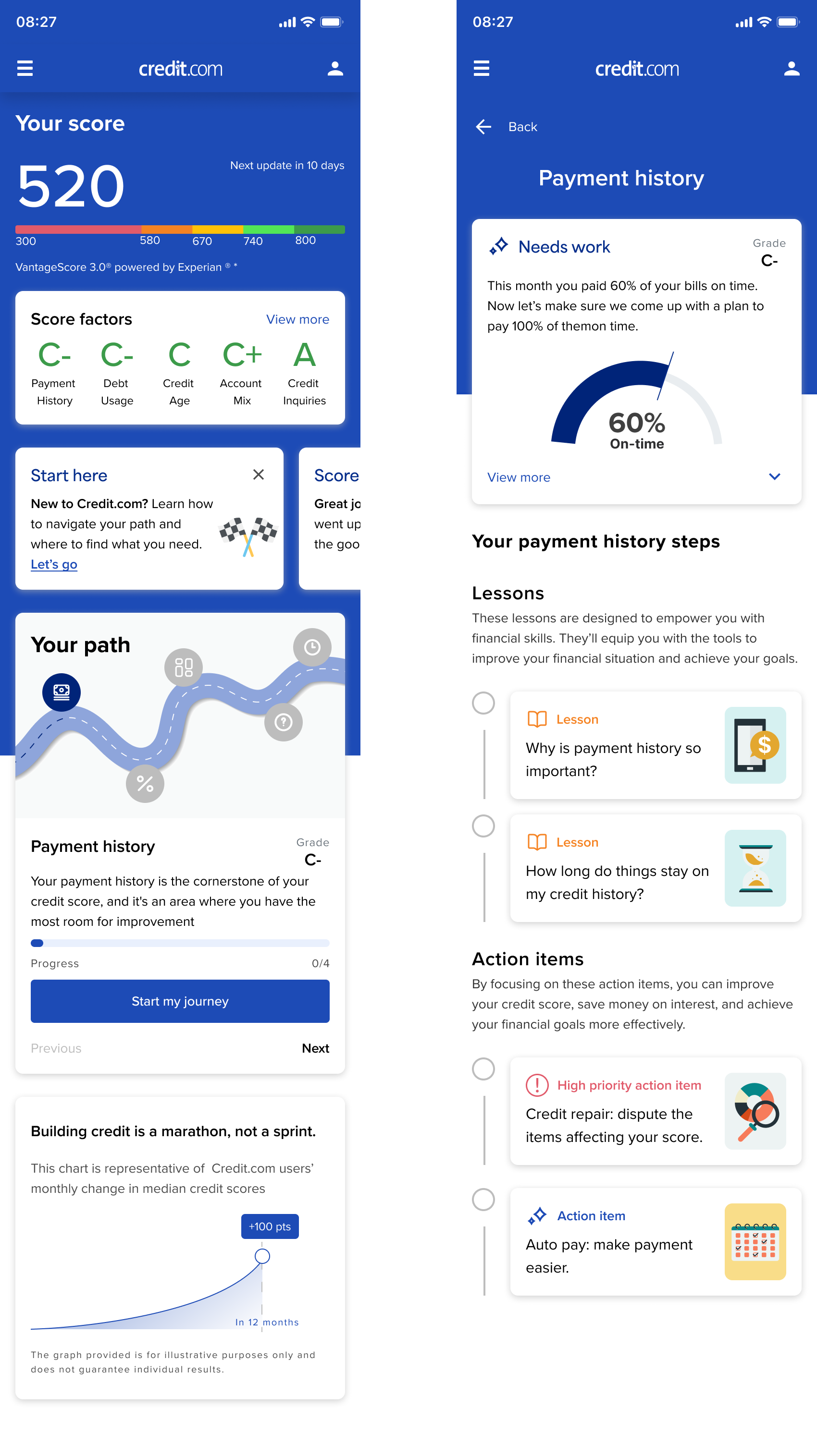
Exploring the Path to 800 Concept
Two Competing Concepts: We explored “Rise to 800” (marketing-led) and my “Path to 800” concept.
Personalized Roadmap: Path to 800 provided tailored recommendations and lessons based on each user’s credit factors, mapped in a detailed planning sheet.
Cross-Functional Feedback: Before user testing, the design was refined with input from the VP, board members, and other teams.
Selected Concept: Path to 800 was chosen to move forward for further development.
User Validation: Prototypes were tested with existing users and paid testers via Maze to evaluate clarity, usability, and appeal.

The Solutions
Enhancing Actionable Insights
Problem
The letter-grade scoring system itself was effective and well-received, giving users an at-a-glance understanding of their credit standing. However, the surrounding content in the widget was cluttered, confusing, and hard to digest. This extra noise created unnecessary cognitive load and made it difficult for users to clearly understand why they received a particular grade or what concrete steps they should take to improve.
Solution
We retained the intuitive letter-grade system but stripped away unnecessary clutter to focus on clarity and actionability. The new design enriches the widget by:
Explaining the why behind each grade in clear, concise language.
Highlighting the user’s positive financial behaviors.
Providing personalized, step-by-step recommendations for improvement.
This shift transformed the widget from a static score display into a dynamic, educational tool.
Impact
Users can now quickly understand not only their standing but also the reasoning behind it. By surfacing positive habits and actionable guidance, the redesigned widget reduces cognitive load, empowers users to make meaningful progress toward their goals, and increases overall satisfaction with the Credit.com experience.
Crafting a Personalized Financial Roadmap
Problem
Users needed a clear roadmap to improve their credit, but the challenge was showing both what to do and why it matters without overwhelming them. Stakeholders also wanted the path to feel flexible, not rigid.
Solution
I designed an interactive “Path to 800” journey tailored to each user’s credit profile. Each step explained the action and its impact, while the roadmap adapted to individual needs to avoid a one-size-fits-all approach.
Impact
The concept turned abstract credit improvement into a motivating, personalized journey. Testers felt more informed and in control, and the design helped Credit.com show a stronger, user-centric value proposition.
Gamifying Financial Education
Problem
Credit.com’s blog had rich educational content, but it was buried in long-form articles that were hard to digest quickly.
Solution
We reimagined this information as bite-sized, visually engaging modules. By introducing interactive and gamified elements, we made learning about credit feel approachable and even fun.
Impact
Users could now absorb key financial concepts faster and with less effort, increasing both engagement and retention while positioning Credit.com as a trusted financial guide.


User Testing
Gamifying Financial Education
Approach
Using Maze, we turned key prototype flows into interactive tests with both Credit.com users and paid testers. Our focus: gauge sentiment on the new experience and test discoverability of core features.
Key Insights
Users responded positively to the concept of personalized guidance.
Educational content was appreciated, but users prioritized actionable, credit-improving steps over general learning.
Some presentation patterns needed refinement to make insights clearer and more immediately useful.
Impact
These findings not only validated the “Path to 800” concept but also helped us reprioritize future development—focusing first on actionable guidance, then layering educational content for added value.
The Takeaways
Testing Turns Assumptions into Evidence
User testing validated (and sometimes redirected) both stakeholder ideas and design hypotheses. Real feedback fueled alignment and made strategy conversations data-driven rather than opinion-based.Evolve, Don’t Overhaul
Keeping the letter-grade scoring system while layering in richer insights showed the value of balancing familiarity with innovation—helping users feel grounded while delivering fresh utility.Action Beats Information
Users don’t just want knowledge; they want clear, bite-sized, actionable steps. Designing for action over overload proved essential for engagement and impact.
Previous project: MFA Implementation