Lie detector sign-up-Lexington Law
This initiative encompassed comprehensive user analysis and iterative design. The result was a 14% boost in conversion rate, directly impacting user acquisition and product growth.
Role: Lead Product Designer. Collaborated with Marketing, Engineering, Legal and Compliance teams
Overview
Our main sign-up flow was underperforming, so our CX team proposed a "Lie Detector" concept to boost conversions and attract new customers. I was tasked with redesigning and defining this innovative new sign-up experience, aiming to transform a weak point into a compelling, engaging entry point for users.
The challenge
The stakes were incredibly high for this project. Our main sign-up flow was underperforming despite high traffic, directly hindering user acquisition. My challenge was to completely redesign our 6-step sign-up process, integrating diverse input from cross-functional teams to ensure a successful, high-impact solution.


Why was this important for the business?
Critical Business Impact: This project was vital because our main sign-up flow, historically our best performer, had been stalling, directly impacting new customer acquisition.
High Stakes, High Traffic: With significant daily traffic, improving this core flow was crucial for business growth.
14% Conversion Lift: The redesign resulted in an impressive 14% increase in conversion rate.
Tangible Business Growth: This directly translated into a substantial rise in new customer registrations, providing a healthier pipeline for the entire business.

430k active users
in the past 5 years

600k free credit reports
in 2023

53.51% drop off rate
on step 1 of our sign up

14% conversion lift
with the redesign
Step 1 drop off rate reduction
53.51%
to
22.51%
Why was this important for the user?
14% More Users Successfully Onboarded: The overall 14% lift in conversion rate means significantly more users were able to successfully navigate and complete the sign-up process, gaining access to our product or service.
Less Intimidating Experience: The redesigned flow was crafted to be far less daunting than its predecessor. We removed friction points and simplified the journey, making the initial interaction with our brand feel welcoming and approachable rather than overwhelming.
Dramatic Reduction in Step 1 Drop-off (53.51% to 22.51%): This is a huge win for user experience. Our original flow saw over half of all potential users abandoning ship at the very first step. By reducing this drop-off rate from a staggering 53.51% to just 22.51%, we clearly indicate that the initial hurdles were significantly lowered.
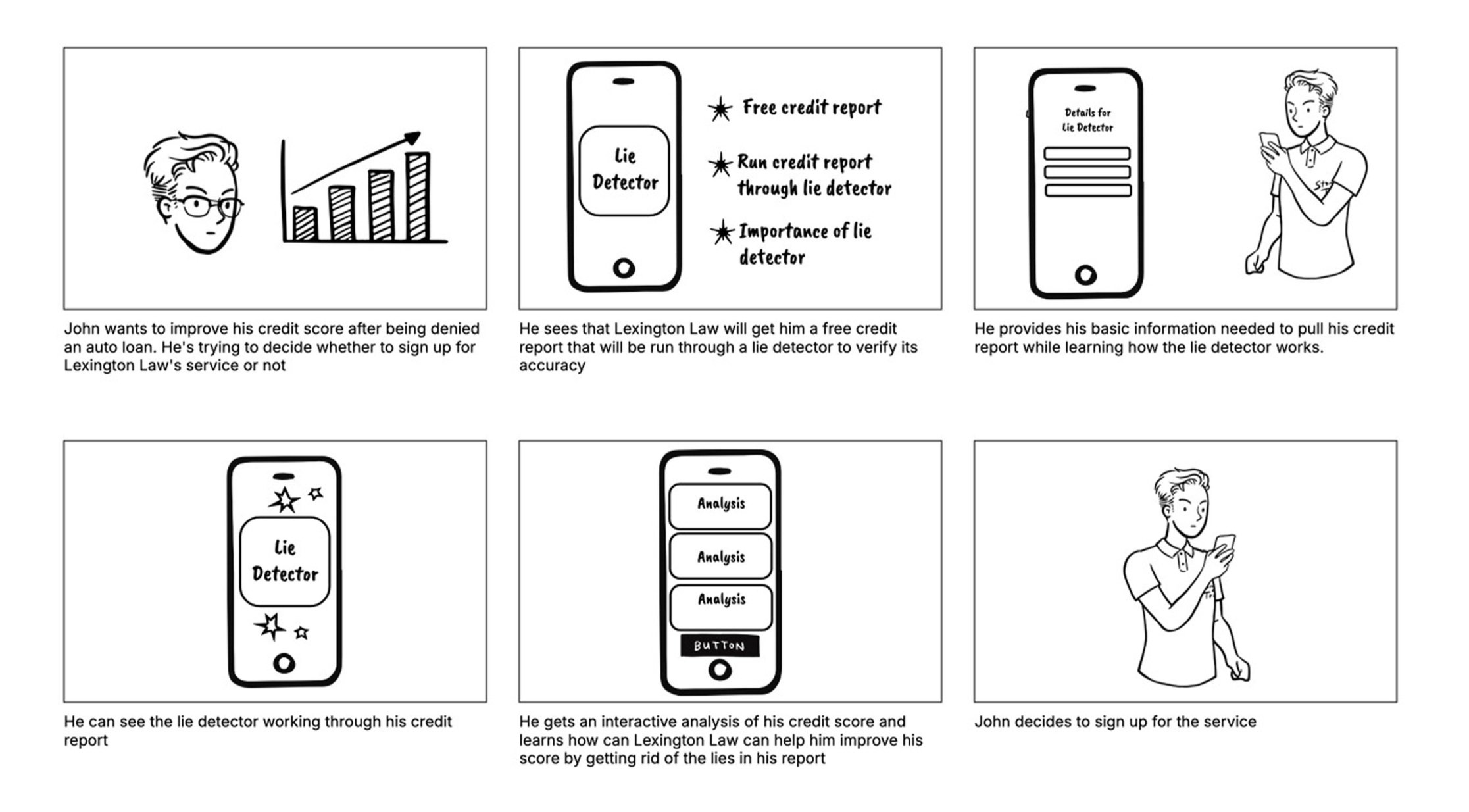
Working closely with the CX and Marketing teams, a crucial step in this project was developing a storyboard. This wasn't just a design formality; it was a highly effective visual communication tool that allowed me to clearly articulate the proposed user journey and the interactive elements of the redesigned sign-up flow. By presenting a step-by-step visual narrative, we ensured that all cross-functional teams were completely aligned on the vision, functionality, and overall user experience before development even began
Ideation
Our previous Step 1 contained six input forms, creating significant user friction.
This page experienced our highest drop-off rate, severely hindering new user acquisition.
Many required fields were unnecessary for immediate lead generation or user benefit, adding to the user's burden.
Reduced to Essentials: The redesigned Step 1 now collects only the absolutely necessary information to create a viable lead, eliminating all extraneous fields.
Refreshed Brand Identity: This streamlined initial step was also updated to reflect the new look and feel of our brand, providing a modern and consistent user experience from the very start.
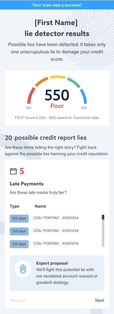
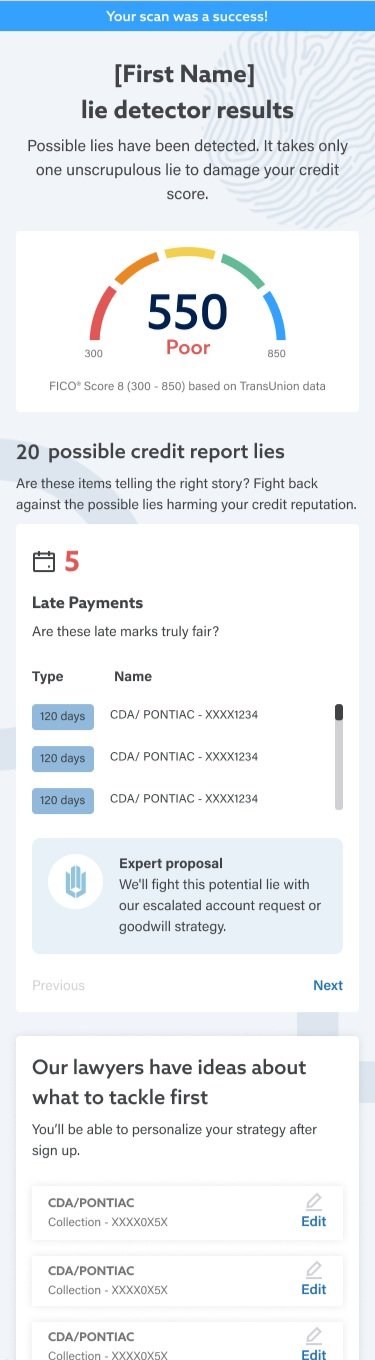
Streamlined Focus: All unnecessary sections were removed, ensuring the page focused purely on the credit assessment results.
Detailed Credit Report Insights: More comprehensive and detailed information about the user's credit report was integrated, providing clearer context.
"Expert Proposal" Section: A new "Expert Proposal" section was added, offering users valuable insight into how our service specifically plans to help them address and remove certain items from their credit report.
Prioritization Control: A "Prioritization" section was introduced. Users can now see which items we would work on first and, crucially, gain the ability to prioritize those items themselves, empowering them with control over their credit repair journey.

Optimized Credit Assessment Results: Clarity and User Empowerment

New design enhancements
Design decisions
Streamlined Step 1: From Friction to Conversion

New design enhancements
Old design flaws
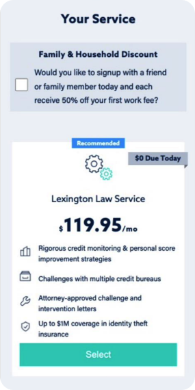
Enhancing Plan Clarity: From Vague to Value-Driven
New design enhancements
Enriched Information: The redesigned plan details now include substantially more comprehensive information about each plan. We've gone beyond basic features to explain the tangible benefits and value users will receive.
Enhanced User Experience: By providing a clear and detailed understanding of what they're getting, we've significantly enhanced the user experience, building trust and making our plans inherently more appealing. This empowers users to make informed decisions with confidence.
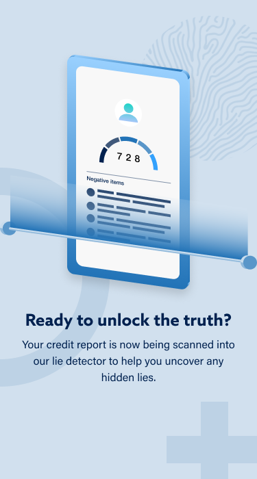
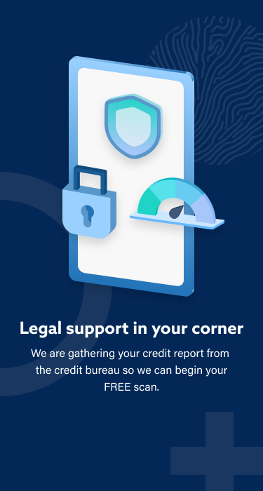
To truly sell the innovative "Lie Detector" concept for our sign-up flow, I designed and created a custom animation. This animation served as a compelling visual representation of the user's credit report being "scanned for lies," directly embodying the project's unique theme.
Crucially, this animation also functioned as a dynamic interstitial page. Instead of a bland loading screen while we gathered credit report data, users were presented with an engaging, branded experience. This transformed what could have been a somewhat boring or frustrating wait into a delightful and captivating moment in the user journey, further enhancing the overall user experience and reinforcing the "Lie Detector" narrative.
Old design flaws
Wasted Space: The previous layout was excessively long with significant "wasted real estate," adding no significant value to the user.
Misplaced Content: It unnecessarily included sections for reviews and FAQs. This content is better suited for dedicated information or marketing pages, not within a critical sign-up flow.

Old design flaws
Our previous "plan details" section was severely lacking, offering only four generic bullet points about what the plan included.
This critical information was unavailable anywhere else on our website, forcing users to make decisions with incomplete knowledge.
The sparse details made our plans appear less attractive compared to competitors, who provided more transparent and comprehensive breakdowns.

Bringing Data to Life: The "Lie Detector" Animation
Takeaways
1, Phased Rollout for Measured Iteration
While the complete overhaul delivered significant results, a key learning is the value of a redesign in stages rather than one big overhaul. This approach would allow for more precise measurement of each new iteration's impact, providing clearer data on where further refinements are most needed. It enables a more agile and data-driven optimization process, allowing us to pinpoint specific areas for improvement with greater accuracy.
2. The Power of Stepping Back
This project underscored the critical importance of periodically taking a step back and analyzing the entire user flow from a holistic perspective. It's easy to get caught in continuous small iterations on existing elements. However, a broader review helps identify if certain steps, fields, or even entire sections have become redundant or unnecessary over time, without us realizing it. This often uncovers opportunities for significant simplification and improvement that individual A/B tests on isolated elements might miss.
3. The Blend of Innovation and Data-Driven Design
The success of the "Lie Detector" concept demonstrates the power of combining a creative, innovative idea with rigorous, data-driven design. While the initial concept was novel, its execution was grounded in understanding user pain points (e.g., the high Step 1 drop-off) and meticulous measurement of improvements (e.g., the 14% conversion lift, the reduction in Step 1 abandonment). This balance between delight and efficiency is crucial for impactful user experience work.